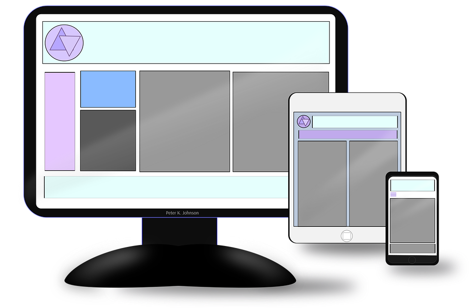
Responsive web development is incredibly important because of hand held devices. The amount of mobile users now outnumbers the number of desktop users. Because of this many web companies have adopted a mobile first development approach and design for a mobile device first. By designing for the smallest screen size you can then work your way up.
Responsive design styles respond to the type of screen being used. The same goes for HTML. Adaptive designs, on the other hand, show a different view for mobile and desktop for the same site. The layouts aren’t conceptually fluid as they are with responsive design.
The Shift From Desktop To Hand-Held Devices
Since so many people are using their mobile devices to access the internet, it only makes sense to create better experiences for the users. Since mobile devices are strained by their screen size a different approach is needed. If you don’t do this it makes the content hard to read and navigate.
Responsive web development suggests that the design and development of a device should respond to the user’s environment and behaviour. This is based on screen size, orientation and platform.
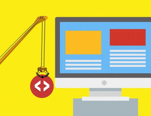
How To Achieve Responsive Web Development
You will need to use flexible grids and layouts, CSS media queries and images. When the user switches from their laptop to their iPad or phone, the website will automatically adjust for image size, scripting abilities and resolution.
Media Queries
Cascading style sheets (CSS) specify when a certain style takes effect. For example, CSS3 has style sheets that target a device’s display. It can serve multiple devices depending on the query response. This includes desktops, smartphones or tablets. CSS3 can do this because of its expanded query capabilities.
Flexible Grids And Images
You must avoid fixed-width parameters if you want a fluid layout. For grid layouts responsive design pages use x and y coordinates. Mathematical percentages are used for images. These two techniques will create a fluid layout that will resize itself so that it can fit the size of the display.
Furthermore, it’s important that your website automatically responds to the users preferences. It creates a simple and fun experience. No one wants to deal with something complicated.
Responsive web development creates a fluid layout that automatically responds to the users behaviour. It gets rid of the need for a different design and development phase each time there’s a new gadget in the market.
Finally, adaptive web development doesn’t do this. Instead, it shows a different layout for everything even if the website is the same. The screen on a desktop for the same website will look completely different on the phone.
Responsive web development has definitely become the top choice for many. Microsoft, Disney and Google are some examples. It leads to a friendlier web experience and is a great SEO strategy. This is all thanks to the multi-device approach.
Remember, some of the biggest names in the business use this strategy. Will it become the top choice for yours too? To talk to us about making your site responsive, contact us today.